
I’ve put together this series of articles to share some of the lessons I’ve learned over my years in web design and development.
Introduction
I’ve spent a lot of my career working in agile teams where quick turnaround and quick results outweigh perfection. Phrases like “Done not perfect“, “Get it released and we’ll come back to it” and “iterate iterate iterate” were not unheard of.
While this leads to a better product and faster releases it’s not uncommon to never “come back to it” and never make it perfect. Ultimately the user is one who pays when you take a shortcut you never correct.
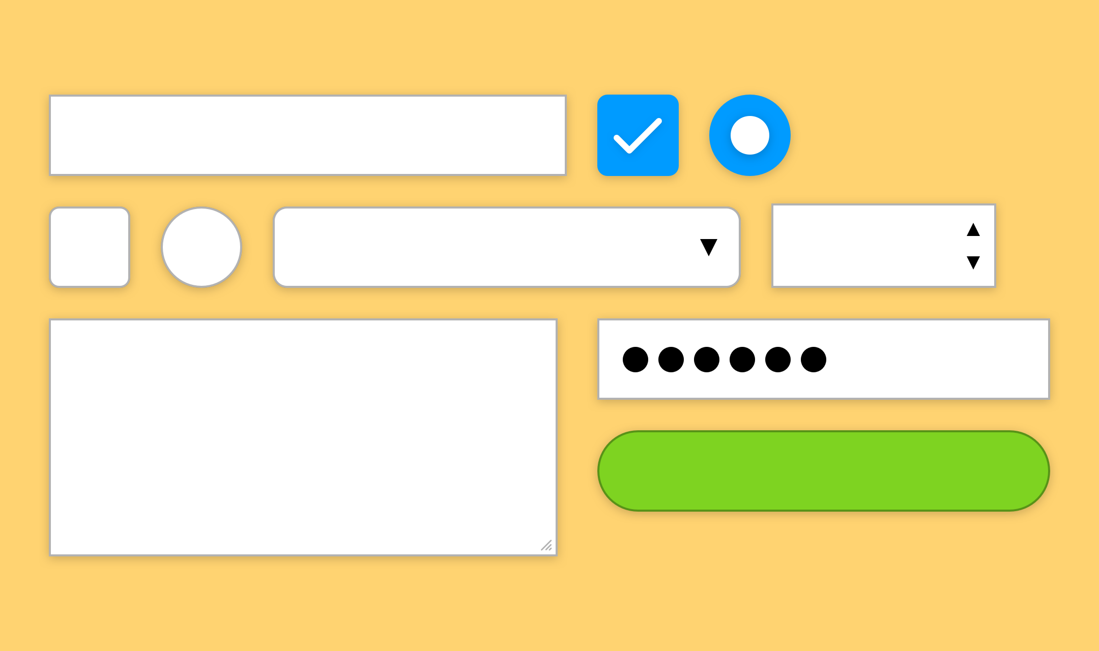
Forms are boring. No one enjoys creating a form from scratch. I bet when a form is part of a project it’s more than likely an important part – one that probably needs a decent amount of UX focus.
By illuminating these bad habits and promoting some basic enhancements your next form will be both “done” and pretty damn close to “perfect”.
Series
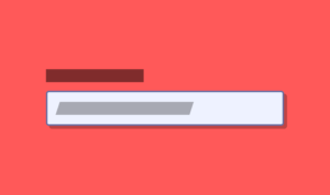
- Labels should be clickable
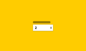
- Not all numbers are alike
- Placeholders are hints, not labels
- The one about validation (coming soon)
- The one about types (coming soon)
- The one about reducing your stupid long forms (coming soon)
Future articles
I’ll be adding to this series of articles from time to time so please consider subscribing if you’re interested in more articles like this and you’ll receive an email when the next one is published.


Hi John
Loved your “Labels should be clickable” and “Not all numbers are alike” reads from “Forms – Bad Habits & Basic Enhancements” – are you still planning on writing the rest of the series?
Louise absolutely I am! I’ve been a little sidetracked with work but I have the structure of the rest in the series ironed out. Stay tuned!