Quick Summary
I worked to make improvements to THT’s self-service portal, MyAccount, to make reporting problems online much easier. My team and I identified areas with problems, facilitated workshops with customers and stakeholders, created prototypes and ran user testing sessions to create the best solution.
Jump to headings:
- Introduction to the project
- What is the repairs section?
- Understanding problem statements
- Research
- Workshopping ideas
- Designing wireframes
- Designing prototypes
- User testing sessions
- The project continues
- Tools and processes used
Introduction to the project
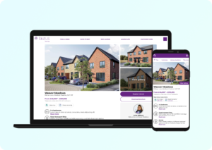
Tenants at THT all have access to a self-service portal called MyAccount that allows them to make rent payments, report issues in their neighbourhood and report problems in their home for repair.
As a business, we want to drive more customers to use the self-service option instead of getting in touch by phone or email which use more resource that could be better spent on more complex issues.
One of the main transactions customers make on the phone is reporting issues with their property. Around 70% of these transactions are by phone or email and around 30% of transactions are self-serve through MyAccount. So the repairs mechanism would be the focus for this part of the wider project.
What is the repairs section?
In context to this case study, it’s important that the repairs section is explained. The repairs section is where tenants will visit when they have a problem in their home they need fixing. This could be issues like leaking taps, blocked plumbing or doors that won’t close.
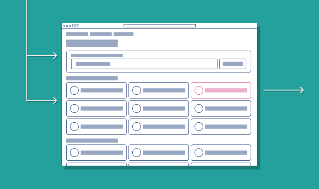
When a customer has a problem in their home they go to MyAccount, login and visit the repairs section of the service. From there a customer can raise a new report where they have the option to search for an issue or select an issue from a list.
The list, referred to as a decision tree, is a user flow where a customer would select a high-level issue, like a blocked toilet, and answer follow-up questions about the problem. In the end, the customer then selects a date and time slot for an engineer to visit their home to fix the reported issue.
Understanding problem statements
When we started the project the business had already put together some problem statements that we would use to start investigating.
- Customers started reporting a problem but never booked a time slot for an engineer visit (abandoned booking a repair)
- Customers are not able to easily find options describing the problem they are having
This information had been gathered by previous customer involvement sessions and interactive feedback widgets that are displayed to customers in the self-service portal. The business believes that fixing the underlying issues, both technical and user experience will contribute to higher self-service transactions, which is the ultimate goal of the project.
Research
With the problem statements, we knew what areas we needed to understand better. This research phase was made up of a few different exercises:
- Department and stakeholder workshops
- Documenting current user journeys
- Interviewing and surveying existing customers
- Conducting user testing
Workshopping and journey mapping
It’s important that internally we understood all aspects of the current user journey from user discovery to completion of a repair. A project workshop was set up with stakeholders and the relevant departments.
In this workshop we discussed how a customer typically reports an issue on the phone, the language they use and what differences in the process are applicable to a phone report versus an online report.
From this workshop, it became clear there were differences in processes for online reports versus those made over the phone. We also knew from candid discussions in the workshop that customers may understand an issue differently from how we allow them to report them.
Customer interviews and surveys
We ran an email campaign to survey customers to try and understand the sentiment around MyAccount and the repairs process. This same campaign was used to recruit customers for the in-person user testing sessions we planned to run.
Using the survey we wanted to understand through qualitative data when a customer may choose to pick up the phone over using the online portal. We could use follow up questions to get qualitative data around why those decisions were made by customers.
User testing sessions
Through the email campaign, we were able to recruit three customers to join us for some in-person user testing sessions to help identify some issues with the system we had.
I must add that conducting an in-person user test for the first time in a long time, thank in no small part to COVID, was extremely rewarding and it was a great opportunity to have very open discussions with customers about their experiences using MyAccount.
At the same user testing sessions, we were able to briefly test some Figma prototypes I had created. The prototypes were designed based on ideas we discussed in the project workshop and were produced to act as a visual asset.
Since we had customers for in-person testing it was a great opportunity to at least show them a very rough version of the prototypes and compare experiences between the old version and a new version.
This approach was very valuable because some of the fixes we made in the newer prototypes fixed things customers had mentioned in their feedback of the old version of the system. Although the prototypes were not perfect and didn’t fix all issues, we could test some improvements in the same session and make further improvements before doing more testing later.
Research summary
Through the research stage, we had discovered a number of areas that could cause customers problems and contribute to the problems outlined in the problem statements. We also discovered some issues that surprised us of which would be useful when we work on future phases of this project.
During the research phase we discovered that:
- Customers don’t understand the problem the same way our experts do, so they find it hard to find the right repair.
- We were offering too many repair options on the first step in the user journey, making it difficult for customers to find something relevant – paralysed by choice.
- Terminology differs from region to region and person to person. What someone calls a sink may be called a basin to someone else.
- Our search functionality wasn’t reliable and didn’t bring back all results.
- Customers found it easier to filter by room instead of picking from a long list.
- When customers can’t find time slots that suit, they call the hub assuming more slots are available.
- Not enough time slots available to customers.
- It can look like all time slots are unavailable, even when slots are available.
- When a customer arrives at the booking step, the job is logged in the system without a time and date. (technical issue)
- When a customer leaves the repairs flow, their progress and any reported problems are lost.
This is just a snapshot of the UX issues we discovered but it was obvious the key areas of the repairs journey we needed to focus on.
Workshopping ideas
Based on the feedback we gathered we hosted another workshop with stakeholders in the business to discuss the feedback and possible solutions.
From this workshop, we decided to test some different ideas that may solve the problems customers face.
In the repairs decision tree we decided I would work on:
- Better categorise options within the repairs decision tree mechanism.
- Reduce the number of on-screen options by better categorising repair options.
- Introduce alternative terminology for options where regionally it may be referred to differently (for example sinks/basins)
In the repairs booking section we decided I would work on:
- Make it clearer that options available online are the same as those available over the phone
- Make it clearer which dates have available time slots
- Name time slots to make them clearer
Other teams would look into:
- Make more dates and times available to customers
- Retain progress the customer has made if they leave the page or close their browser
- Stop repair jobs appearing in back-office systems until the customer has actively booked a slot.
Designing wireframes
Having discussed some ideas for solving the issues that customers were facing I started working on some rough wireframe mockups in Figma.
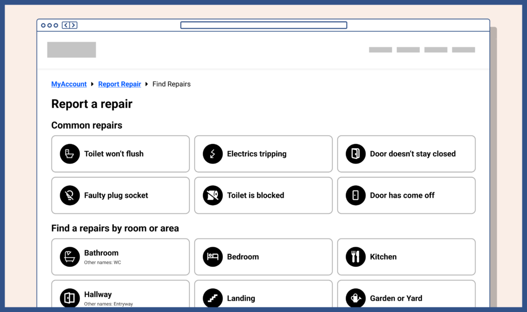
Categorising the decision tree
During the research stage we found that customers felt we were presenting them with too many options at once, and in no particular order.
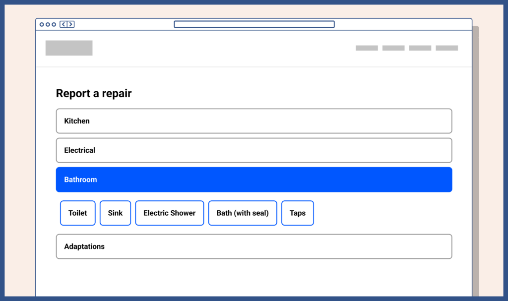
My earlier mockups played with the idea of displaying repairs in a few different categories:
- Common repairs
- Repairs by room
- Repairs by trade
- Repairs by type
From talking to customers during our research sessions we know that in some situations they would know what kind of trade would be required for a repair. However, in some situations, they would not. For example, a light switch not working they know is an electrician, but wouldn’t know whether an electric shower issue is an electrician or plumber.
Almost all the participants agreed that they would naturally look at common repairs and then filter by room.
We opted to design prototypes with 3 of the 4 options,
- Common repairs
- Repairs by room
- Repairs by type
So I came up with a version of the decision tree that uses these categories, renaming “By type” to “By category”.
Reducing on-screen options
By categorising the repairs better I was able to reduce the number of different options on screen at any given time.
When a customer selects a room category they are presented with options relevant to that room only. Previously a customer saw all rooms and various other categories and even as they drill further down into options would still have the noise of everything else.
Introduce other terminology
During our stakeholder workshops and customer sessions we knew that people use different names for different things around the home and commonly it’s influenced by things like their education level or where they grew up.
I thought one way we could do this was to use the most common name predominantly but also display “also known as” beside the option. However, this could be perceived as saying one name is correct, and the others are lesser options. Perhaps this also wouldn’t make it obvious to customers who referred to it by the other name.
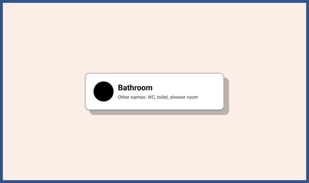
I pushed on with my initial idea but noted that we would need to test a few different variations of this design choice.
Make it clearer that options are available on days
When we ran the research with customers we had a few comments in surveys and during the in-person testing that the way we display dates and time slots isn’t very clear.
During the in-person session, customers suggested that displaying the available dates and times on a calendar would be more helpful. With at least one customer saying they understand dates much better in a calendar view than they do in a list.
On the current system we display days with slots available, but only one week at a time. This meant a customer must scroll along each week to find a slot, with each new week needing to load data.
I agree with these comments and I personally believe the way dates were displayed was confusing and slow.
Displaying a calendar view could make much more sense and give customers a much better representation of what is available for multiple weeks ahead.
Time slot availability on days
On the current version, we were happy that the availability of time slots on a particular day was clear, but we expected when we made changes to a calendar view it would impact that clarity.
I designed a view where each day on the calendar could clearly display how many time slots are available. This would also improve the accessibility of the calendar too. Selecting a date would display the available time-slots.
Better time slot names
Customers told us that the time slots didn’t make a lot of sense and were in a weird order. This made it a little more difficult than they needed to book the right slot.
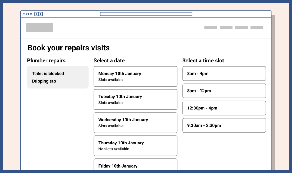
We currently have up to 4 slots available:
- 8am to 4pm
- 8am – 12pm
- 12:30pm to 4pm
- 9:30am to 2:30pm
To customers, these time ranges were seemingly random, and I can see why, but there is actually logic and reason behind them.
- 8am to 4pm is our all-day slot
- 8am – 12pm is our early slot
- 12:30pm to 4pm is our later slot
- 9:30am to 2:30pm is our “avoid the school run” slot
This is why in our stakeholder workshop we opted to name the different slots to be clearer and favour some slots over others.
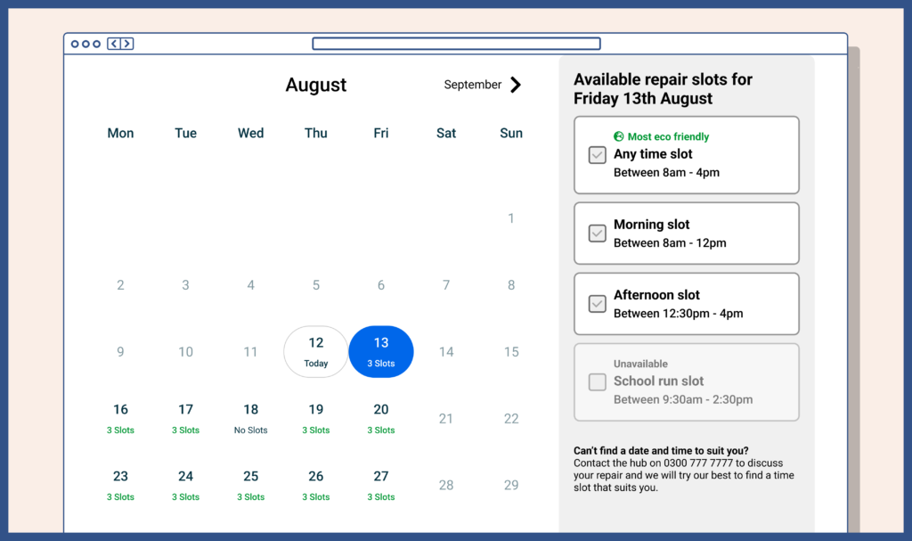
I decided we should initially try:
- Any time slot
- Morning slot
- Afternoon slot
- School run slot
But I fully expected that the fourth option may need renaming or further explanation if customers were still confused.
During our initial workshop with stakeholders, our repairs team planners mentioned that it is much better for the business if a customer books an all day time slot because they plan routes more efficiently but that customers would typically book a smaller window for their visit.
One idea we discussed was flagging a time slot as being more eco-friendly since repairs geographically close together could be planned together, therefore reducing the distance engineers need to travel. I added this to my designs because it would allow us to ask customers during testing how they felt about the feature.
Designing prototypes
With the design elements complete I put everything together into a typical user journey and started planning how we would test the designs with customers.
I felt for the number of areas the new designs touched on it would make the most sense to create an end-to-end prototype using the wireframes mimicking a typical journey through repairs. I created this using the prototyping features of Figma.
I mapped out, on paper initially, 3 different repair jobs that a customer may report. The prototype would then allow for these 3 different paths to be taken by the user. Each of the paths had its own differences and levels of complexity but would allow us to test a few different ideas in the same workshop or remote testing sessions.
The repair job paths I created were for a:
- Blocked toilet
- Broken light switch
- Door that won’t close
User testing sessions
We ran 2 different user testing sessions for the prototypes. Remote stakeholder user sessions and in-person customer testing sessions.
The remote sessions were conducted using Lookback and the subjects were shown instructions within the prototype and their interactions were recorded and later reviewed and documented. We were looking for usability issues and areas anyone would be confused about and placed lesser importance on user sentiment since they were not our target audience.
The in-person sessions were largely the same as our earlier customer session but with the customer being shown a more finished prototype of changes. Customers were given one of the 3 jobs to complete and each was observed as they used the prototype and any issues documented. Here we were interested in usability issues, areas of confusion and user sentiment.
Feedback was given by customers after the testing and the feedback was collated and shared with the wider project.
Key takeaways
After the testing session and after the feedback was collated we were able to get a clearer picture of what was and wasn’t important to customers.
Things we expected but had validated by customers:
- Customers typically looked for repairs in common repairs and then by the room the issue was in.
- Customers found the icons somewhat helpful in identifying the type of issue.
- Customers would almost always use the search function before manually searching.
- Customers understood the time slots better than previously
- Customers thought the calendar view was clear at showing available days and the number of slots available.
Things we discovered but didn’t expect:
- Customers would still select the most convenient time slot, regardless of eco-friendliness (although further testing at scale may be needed on this)
The project continues
As I write this case study the project is still ongoing and the changes are still being implemented.
There is a plan for future UX work at future stages so I wanted to outline how we plan to go on.
User testing on prototypes couldn’t really happen at scale so when we have the changes implemented I plan to continue user testing using Lookback using the test version of the platform, both with customers and stakeholders.
How customers interact with the website will be monitored using Hotjar when the new updates are released.
Minor changes, like displaying an eco-friendly badge on time slots, will be tested on a live environment using A/B tests to see whether it encourages more customers to select that option over others.
Ultimately the success of this project will be down to how many customers decide to report a problem in their home online instead of picking up the phone. At this point we are highly confident the design solutions will be the solutions needed for the problem statements.
I will update this case study as the project develops.
Tools and processes used
Summary of the different tools and processes used during the creation of the new MyAccount repairs journey.
Tools
- Figma – used for wireframing, prototyping and lo-fi and hi-fi designs
- Miro/FigJam – journey mapping
- Lookback – unmoderated user testing
- Qualtrics – customer surveys
- Google Analytics – gathering customer data of current usage
- Hotjar – gathering customer insights on the current usage (heatmaps, recordings)
Processes
- Wireframing
- Stakeholder and customer workshops
- Moderated user testing (in-person)
- Unmoderated user testing (remote)
- Customer interviews