As part of a project for Laurus, the development arm of THT, time was spent looking at the website, more specifically the individual site development pages, and understanding what users needed to inform their decision and complete a lead generation form.
The development pages for Laurus are the typical entry point for visitors due to targeted ads and development specific SEO being done around them. On Laurus, the homepage is not the primary entry point.
Identifying lead generation issues
Laurus was spending money driving traffic to specific development pages through social and PPC ads. A low percentage of this traffic was turning into registered leads for Laurus, which means the conversion rate of the website is low.
There are a few areas that we discovered to be affecting the overall amount of leads being generated through the website:
- Primary customer touch points not being optimised to generating leads
- Information to satisfy typical customer questions being hard to find
- Lead generation forms not being optimised well enough
The first and last points are areas that are not covered in this case study but the summary of the issues and solutions are included for completeness.
Primary touch points
Laurus places a tremendous amount of weight on the telephone number being the primary contact method for customers with questions. Customers typically call if they have a question about a development site or particular property availability.
Telephone is hard to track conversions through because of its offline nature and Laurus lines are only open during business hours. This means customers visiting the website outside working hours are typically directed to a telephone number that won’t be answered.
A separate project was developed to improve lead generation outside of business hours and ultimately the website would display contact methods dynamically depending on whether or not lines are open.
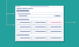
Lead generation form not being optimised
Although alone this won’t impact sales massively we did find that it was causing some friction for customers wanting to sign up using the lead generation form. The first form is to download a brochure and the second form being a register interest form.
These forms were optimised in a few ways to reduce user friction:
- Reduce the number of fields
- Make labels clear but concise
- Mark required and optional fields clearly
- GDPR questions were refined to ask a simpler question and expect a simple answer
- Customer expectations are managed on completion of the form
These improvement methods have been discussed on this website before. A result of making these improvements was a decrease in customer abandonment and an increase in the number of leads generated by these forms.
Information being hard to find
The rest of this case study focuses on the improvements we developed to satisfy the user’s need for information.
Interviewing customers
We interviewed some users who had shown interest in a particular development site to find out how their information search was, and how they felt it could be improved.
We wanted answers to some fairly simple questions:
- What 3 pieces of information are most important to you?
- How easy was it to find this information on our website?
(We asked more questions around overall experience not relevant to the website specifically)
Responses were very similar and we determined that the most important information was:
- What the properties look like
- The price
- The location (this included nearby services, transport links)
- The sizes of homes
Lastly, some responses also mentioned home availability however each development site is different and not all sites had homes available for purchase yet due to the stage they were at. So although important on sites that were open to reservations and purchases, it wasn’t mentioned by sites that were still “coming soon”.
Finding this information on the current site
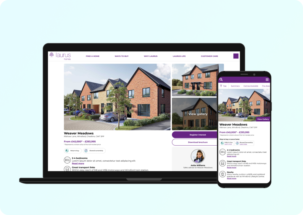
All the required information potential customers need was freely available on the website however it wasn’t presented up-front together.
Images
Visual assets, arguably the easiest for users to digest, were found scattered around the site.
Some images of homes were available in the main website banner. Some images are in the available homes section. Some developments have virtual tours. The site map is found towards the bottom of the page.
Price
This is available at the top of the page and is actually one of the most prominent elements. So this was right where customers needed it.
Location
This information is available at the top of the page but is very difficult to notice due to it overlaying an image and not contrasting well (accessibility issue).
Further information, such as details of nearby services and transport links, are found hidden in tabs further down the page. Again not very obvious to the user and something Hotjar has backed up when viewing how people are interacting with the site.
Size of homes
Again near the top of the page but again this information was very difficult to see and blends in with a lot of the content around it.
Available homes
We are confident that developments that have homes available for purchase or reservation have this information presented very prominently. So this information isn’t an issue.
Improving information discovery
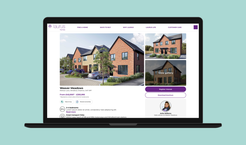
We discussed different solutions for making this information more prominent. The method we eventually landed on and progressed through to prototyping and testing was to basically dedicate the “above-fold” section of the development pages to display a summary of all the required information.
The goal was to make sure all the information users expect and need to make a decision are the first pieces of information you see on the page. For mobile users this would be especially important to reduce the amount of scrolling needed.
Prototyping the design
After wireframing the designs and discussing internally and showing a small selection of users we moved to create high-fidelity designs to be used in user workshops.
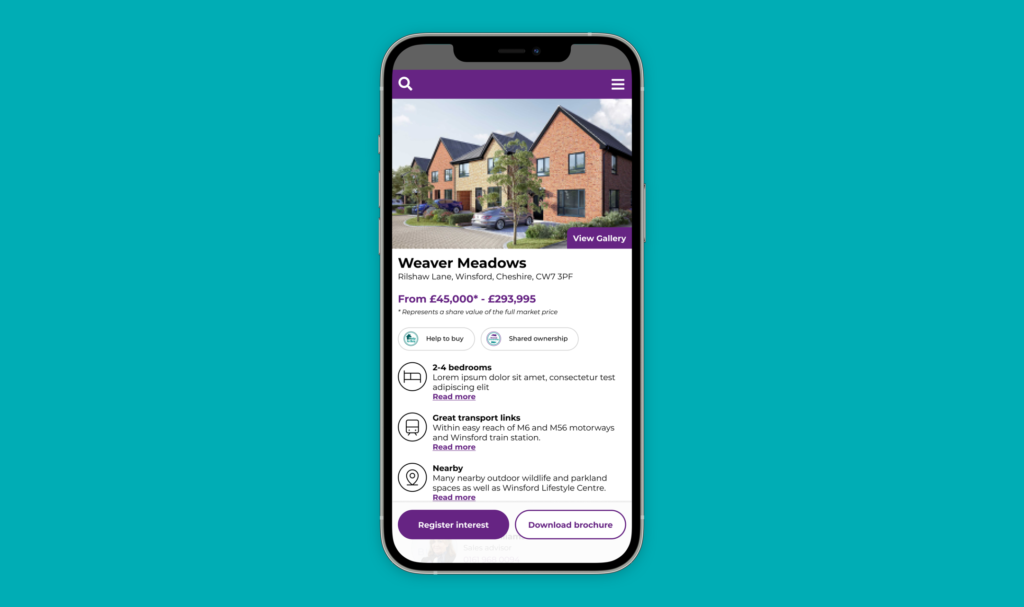
In the prototype, we ensured all the required information was visible high up the page. We also needed to ensure that CTAs on the page were visible as and when a user needed them because once they were satisfied with the information and wanted to sign up or request a brochure, we didn’t want there to be friction requiring a search around the page for buttons.
It was important that any information we summarised could be expanded so we added links beneath anything shortened to jump the user down the page to more information about a key point.
Early user testing
We interviewed some of our audience to understand whether the summary of information was helpful and whether, having used the current site, this summary is more, or less, helpful.
We received some very positive feedback from these interviewees and we were confident in our prototype and proceeded with our technical teams to start implementing the changes.
Next steps
This project is still ongoing and we are currently in the process of implementing the changes in a way that would allow us to A/B test the impact on lead generation.
The test compares the number of leads generated with the current development pages and the number of leads generated with the updates.
As part of a smaller test prior to this we also plan to test whether or not static CTAs versus sticky CTAs has any noticeable impact on lead generation to avoid this part of the bigger change affecting the results.
This post will be updated with the outcome of A/B testing and further user testing.