Due to confidentiality, precise numbers and actual prototypes are not shared in this post. Instead, findings and metrics are summarised and prototypes and wireframes have been recreated to be similar.
One of my first projects at THT was to discover usability issues with the main THT website, understand the user pain points and then prototype some solutions to test on colleagues and website users.
The purpose of the THT website was to make content easy to access on the website so that customers could get answers and be signposted to relevant services without needing to call the customer hub.
Long before I joined there was a major navigational issue that made it difficult for customers to navigate to the information they needed and this was resulting in customers calling the call centre to ask questions that could quickly be answered online.
Understanding our measures
Our goal in the project was to increase content engagement time and increase views to pages that answered the most common questions.
By increasing the amount of content engagement on the website, we could be fairly confident (based on research) that we would have a reduction in basic query calls.
So we focused on the easily measurable content engagement metrics – time spent on page and number of page views to common pages.
Identifying commonly visited pages
Understanding why customers were calling was the key to understanding what pages we needed on the THT website but we also had access to Google Analytics which highlighted the most popular pages and content paths.
It would be important for us to make sure we know which pages customers needed most, so we could make these the most easily accessible from the navigation.
We also noted here that most customers were accessing pages via Google, not via organic routes through the website – again pointing to an issue with navigation, another thing we could keep an eye on during testing.
Identifying the usability issues
We knew from our research why customers were calling, what pages were popular and through auditing the current website where some of the common pain points were.
- The navigation included a link to every possible page, making it hard to find specific pages
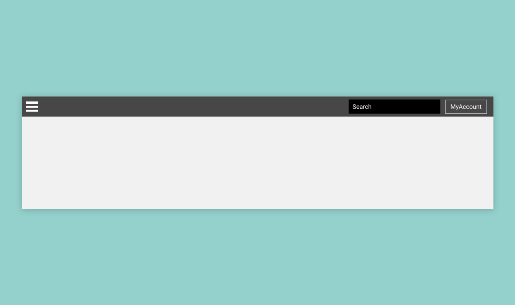
- The entire menu was hidden behind a hamburger menu icon, on both mobile and desktop
- Mobile users (60% audience) have the worst experience when all links are displayed as a one-column list
- The menu wasn’t accessible through keyboard navigation
- The entire navigation was repeated again in the footer
- Menu items have no clear hierarchy
We also knew that for a lot of customers it became much easier to call the hub and have a conversation because call response times were incredibly quick.
Restructuring the navigation
In a joint workshop with UX, Digital and Content were ran a sorting exercise where we would sort pages into high-level groups to help structure the navigation better.
We based the groups on what the customer intent would likely be.
- Getting support with something – this could be support with money, domestic abuse, food support and any other services THT customers commonly require.
- Answering a question as a customer – this could be information on paying rent, reporting repairs, safety information and any other information a customer may need access to.
- Finding a home – We’re a social housing provider with access to new build developments, shared ownership properties and we get a lot of customer queries about finding a home.
- Other services – THT also funds other projects and services through their charity arm, we wanted these to be easy to find for those users too
- About us – About us, about the board, jobs, legal documents, reports, safety and transparency information
- Customer involvement – Information for customers about getting involved and shaping THT services and policies
We also have a self-service product, called MyAccount, that allows customers to pay rent online, report repairs and report issues with their neighbourhood. A common user journey for customers registered with MyAccount is for them to visit the THT website and then go immediately to MyAccount (a different domain). We knew this service needed to be very prominent because of the number of interactions.
We knew that the majority of users were already customers of THT information about us wouldn’t be as important as some of the other content groups. We also knew that a small majority of THT customers take part in customer involvement groups, so again these pages are of lesser importance.
From this workshop we decided to test having the following sections in the header:
- Advice and support
- Customer information
- Find a home
- Our services
- MyAccount
And in the footer we decided to test:
- About us
- Find a home
- Customer involvement
- Media centre
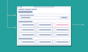
Wireframing a new navigation
We knew hiding the menu behind a hamburger menu on desktop was introducing some issues for customers not familiar with the function, we also knew it was introducing an additional click/tap interaction which wasn’t needed.
Having tested different navigation types with customers on previous projects I had a solid basis to start working on improving the THT navigation.
During this part of the project a few different wireframes were created for navigation types and each was justified from a design rationale perspective. We then decided to test a particular version with customers to gather some feedback.
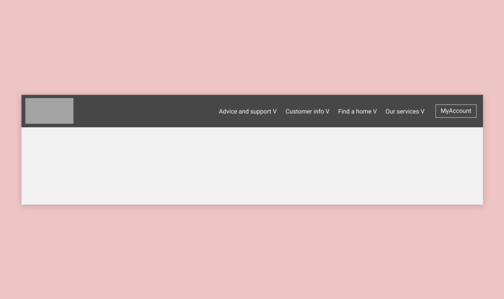
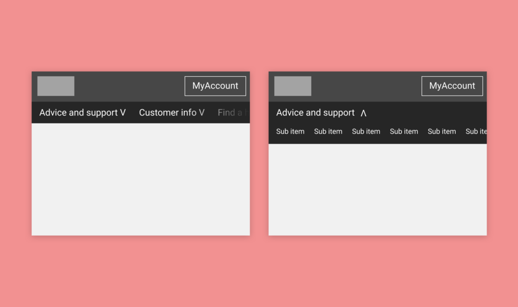
On desktop, the menu would display the top-level content categories in the header. Each link would be clickable to the high-level page and when hovering the sub-navigation items would be displayed.
On mobile, the navigation would always be visible under a reduced height main header with overflow scrolling. This gesture control is common on mobile and I have tested it in previous projects discovering that users know how it works.
To assist with prompting the user to scroll horizontally the menu should always display part of the next item so the user knows there is more.
When clicking an item with sub-menu items the secondary menu displays in place of the primary navigation, again a test pattern.
Referencing previous project testing
Some initial assumptions were made during the design of these wireframes based on previous projects I had worked on and what worked for those users. Obviously, not all users are alike and not all “usable” functionality can be transferred from one audience to another but it was a good foundation to work on.
During this wireframing and design rationale stage we were upfront with stakeholders that assumptions were being made and ultimately we would test how well they would work on customers during the user testing stage.
Prototyping the new navigation
Typically at this stage in a project, a prototype would be created within a prototyping tool like Figma and tested on users in a workshop or one to one session. Due to the nature of a navigation and the team wanting to test design, structure and usability of the proposed navigation we opted to create a HTML version of the new navigation.
HTML and CSS is something I’m well-conditioned in, along with responsive design, so putting together a functional prototype of the navigation wasn’t a huge undertaking and would give the customer the exact experience they could expect in the wild.
View coded prototype on Codepen
Although not the final coded piece the coded prototype was able to be tested on users on both desktop and mobile without different versions being created which is the case often with image prototypes created in Figma.
Accessibility in the prototype
A key requirement for the new navigation is that it would meet accessibility requirements and be fully usable by the keyboard. Special attention was given to the interactions to ensure that multiple options were available to open and close the sub-navigation.
It’s not uncommon for sub-navigations to only appear when you hover on a menu item. This approach completely isolates users navigating by keyboard or other input devices that don’t use a pointer.
During the creation of the prototype special attention was placed on adding and updating the correct aria values during interactions and also ensuring that proper labels are added to assist with screen reader devices.
By doing this we could ensure that the navigation was fully inclusive and that any users, regardless of I/O device, could interact with the website and navigate just as easily as someone using a mouse or touch screen.
User testing
THT have access to various customer involvement groups so there was a group of customers ready to start user testing very quickly. Using a mixture of group workshops and one on one interviews with customers we were able to test the navigation.
The general feedback we received from the original version of the navigation matched what we already knew. The navigation was hard to use, hard to find links and didn’t work well on their phones.
When presented with the new header and navigation the customer feedback was overwhelmingly positive. We observed customers using the navigation as we had expected and found that users on mobiles found the navigation very natural to understand.
Iterating on the design
We did identify some issues while observing customers using the navigation on desktop devices and this was around those customers accessing high-level items, for example, Find A Home. We found that users expected the sub-navigation to appear while hovering over the top-level item, but we had designed that interaction to happen when you hovered or clicked on the down icon.
We also found when customers naturally navigated by keyboard they did not expect the navigation’s sub-menu to appear on focus, but instead, they expected to interact with the down arrow.
So we had two similar issues, but both opposed each other in terms of expectation when interacting with sub-menus.
Ultimately we made some changes to the menu and for pointer device users the sub-menu would appear on hover, as well as on click of the icon. For keyboard users, we prevented the menu from appearing on focus and the user would interact with the down arrow.
In production, we have paid close attention to these interactions from users to ensure we’re not seeing other types of customers being confused.
Deploying the new navigation
Although the project started out with the best intentions of being agile and releasing fast it was decided later that the navigation restructure would be included in the release of a larger piece of work designed to improve the website content.
Releasing these improvements stand-alone would have allowed us to more reliably measure the success of the project and would have ultimately had a bigger impact on the users much sooner.
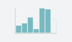
The feedback we received from customers and colleagues in THT was overwhelmingly positive and through analytics data and observation using Hotjar we could see the users were engaging with content much more than previously.
We also observed that the number of typical page views between entry page and exit pages was significantly less, meaning that user journeys became much shorter as a result of the changes. Although on its own this metric doesn’t mean success when compared with time spent on page and the increase in page views we viewed it as a success.
It’s important to place an asterisk above this data because the final release bundle included two projects that would both influence the same measures so it would be naive to suggest that the navigation was the only contributing factor in the success.